Here are the graphs for the original test material used as the
reference to compare all other data. Don't expect the flat frequency
graph we are all used to seeing as the plot is derived from real
music and not a signal generator sweep.
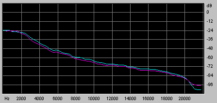
Reference CD Audio Frequency Response
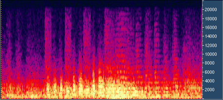
Reference CD Audio Spectral View
As can be expected with most music the vast majority
of spectral energy is concentrated at the lower frequencies. There
is however significant frequency content at the higher frequencies
and as you can see the frequency plot continues right up to 22kHz.
Please take note of the fine detail in the spectral view even at
high frequencies as it is here that you will be able to see considerable
differences in the various codecs.
The bright pillars of red on the spectral graph are
individual notes being played on the trumpet. As you can see the
trumpet produces a lot of high intensity high frequency harmonics
and is a reason why I chose this recording for the test.
This recording has two other noteworthy characteristics
that I used when making comparative listening tests. The first are
faint but clearly distinguishable noises made by the valves in the
trumpet hitting their stops in certain parts of the recording. The
second are the soft but clearly defined notes of the harpsichord
in the accompaniment. I will comment on these features for the various
codecs.
The next few pages have the graphs produced from MP3
output encoded by the ACM pro codec which now can produce output
up to 256kb/s. The high quality setting was always used.
[Back] [Next]